Goodreads Reimagined
Goodreads Reimagined
Project Overview
Project Overview
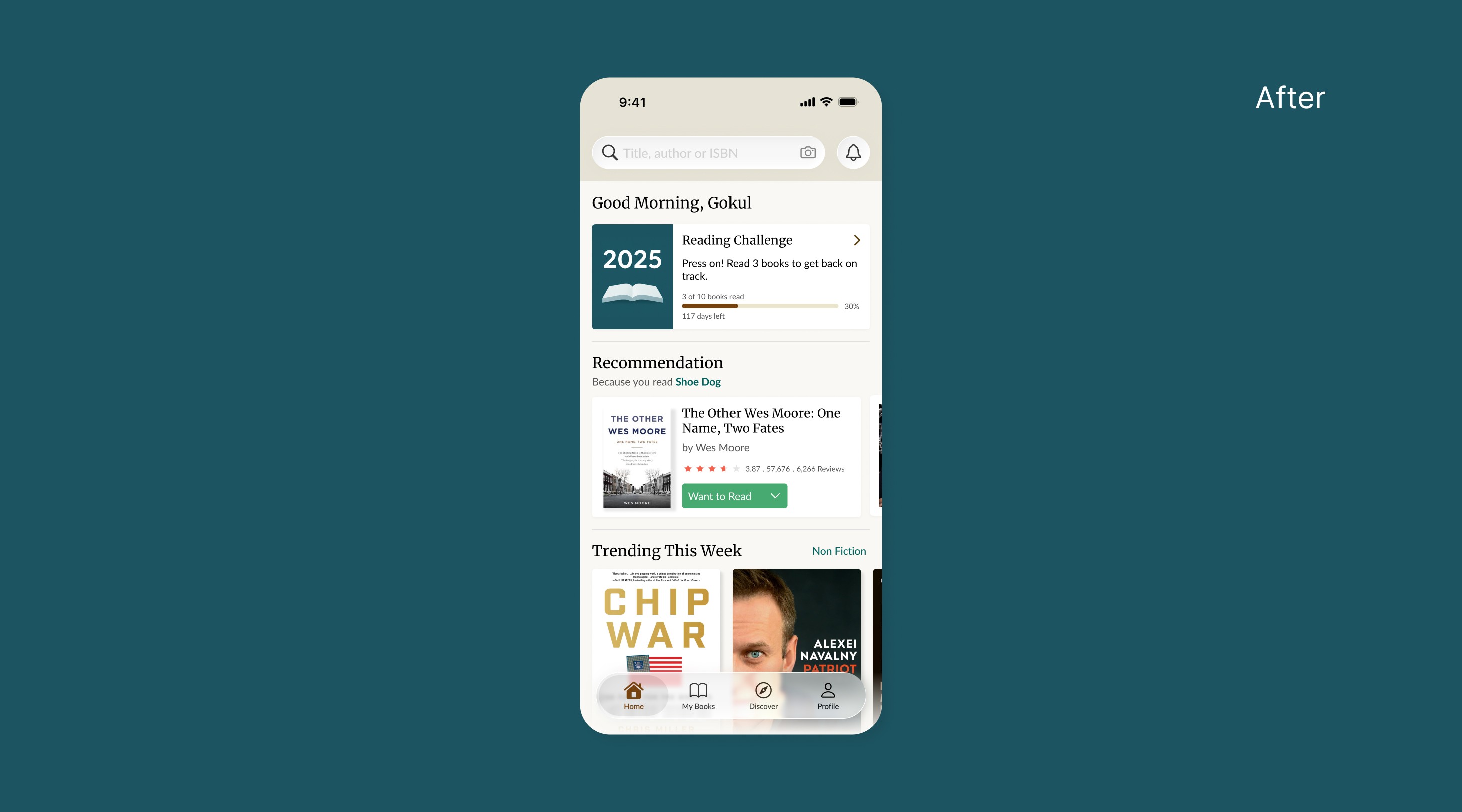
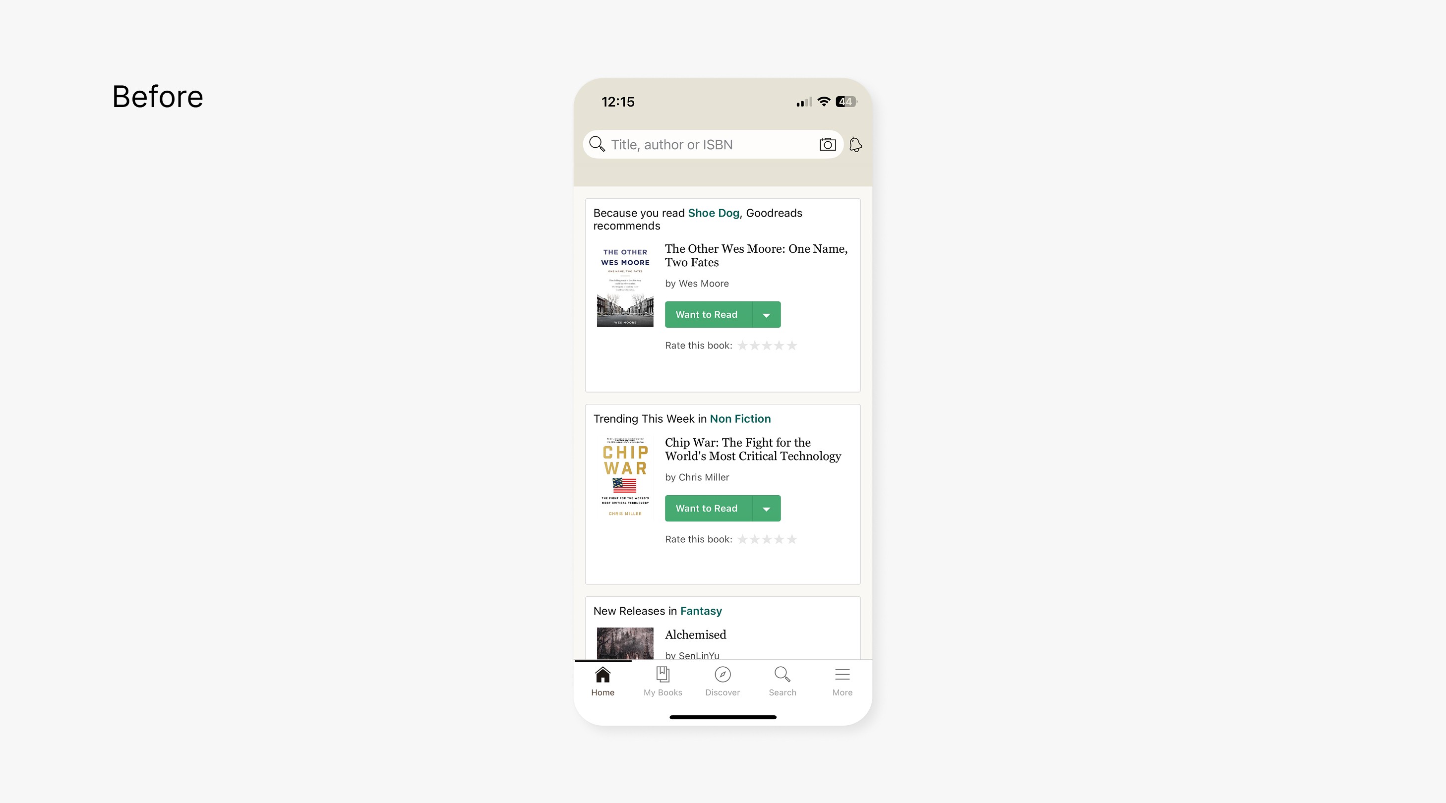
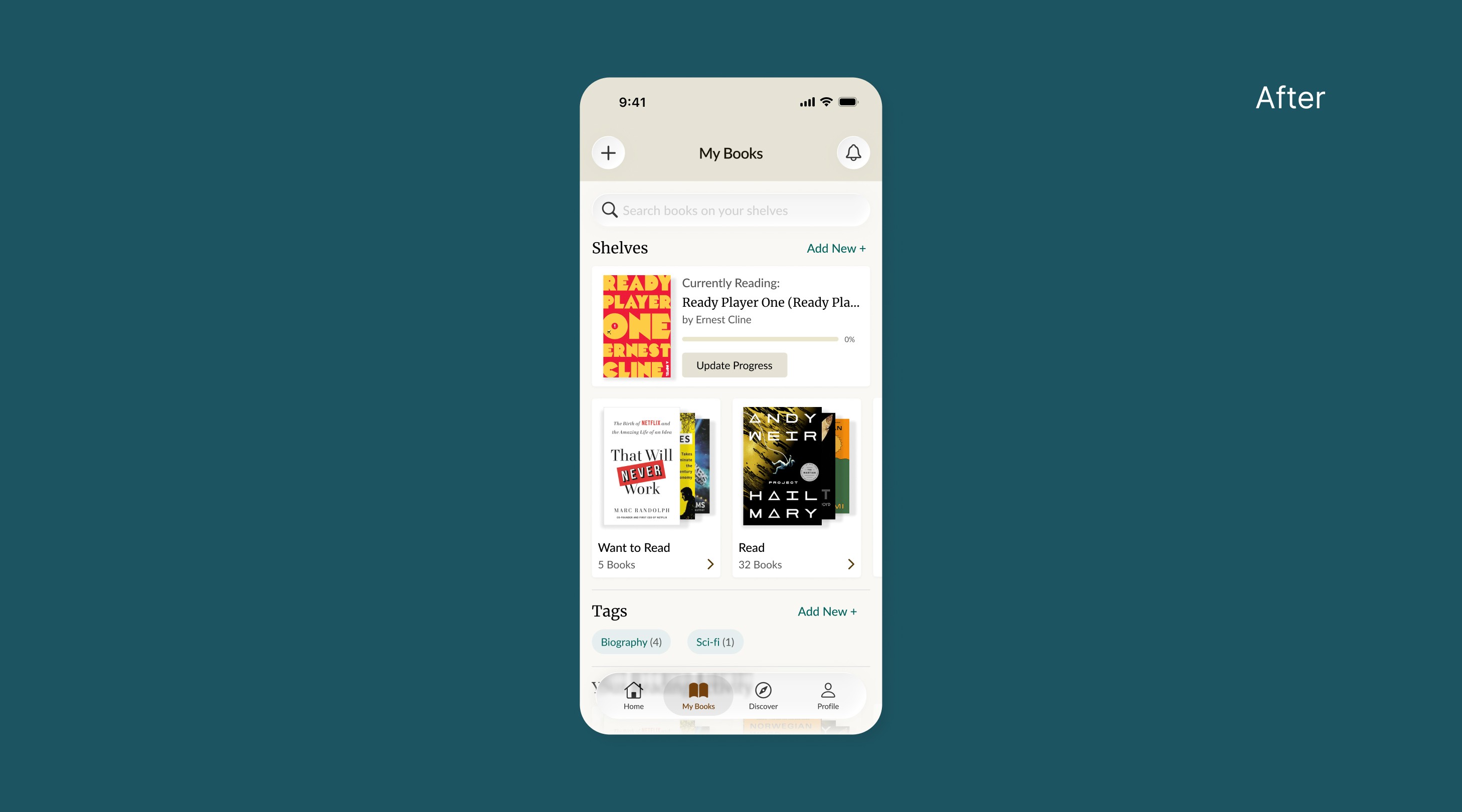
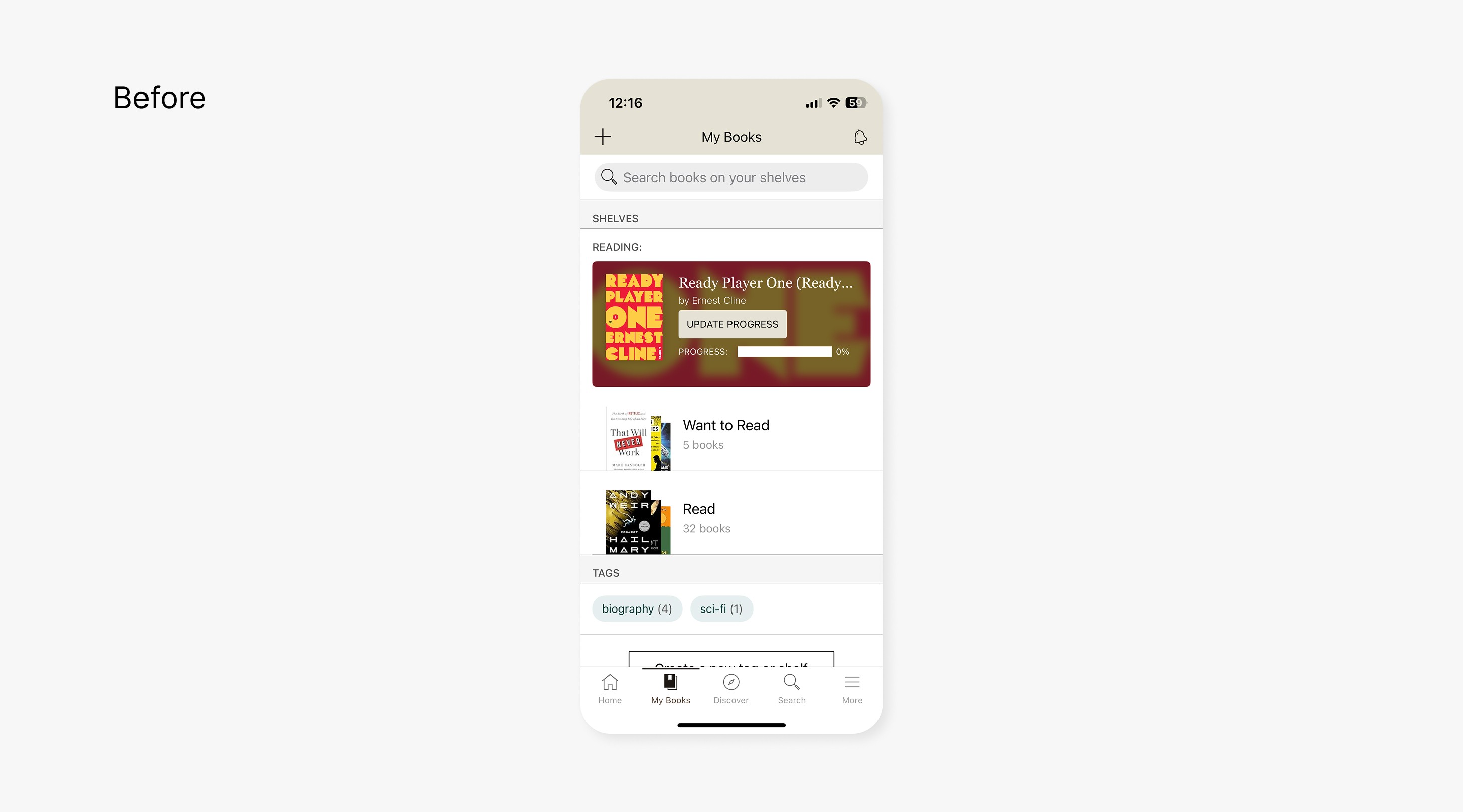
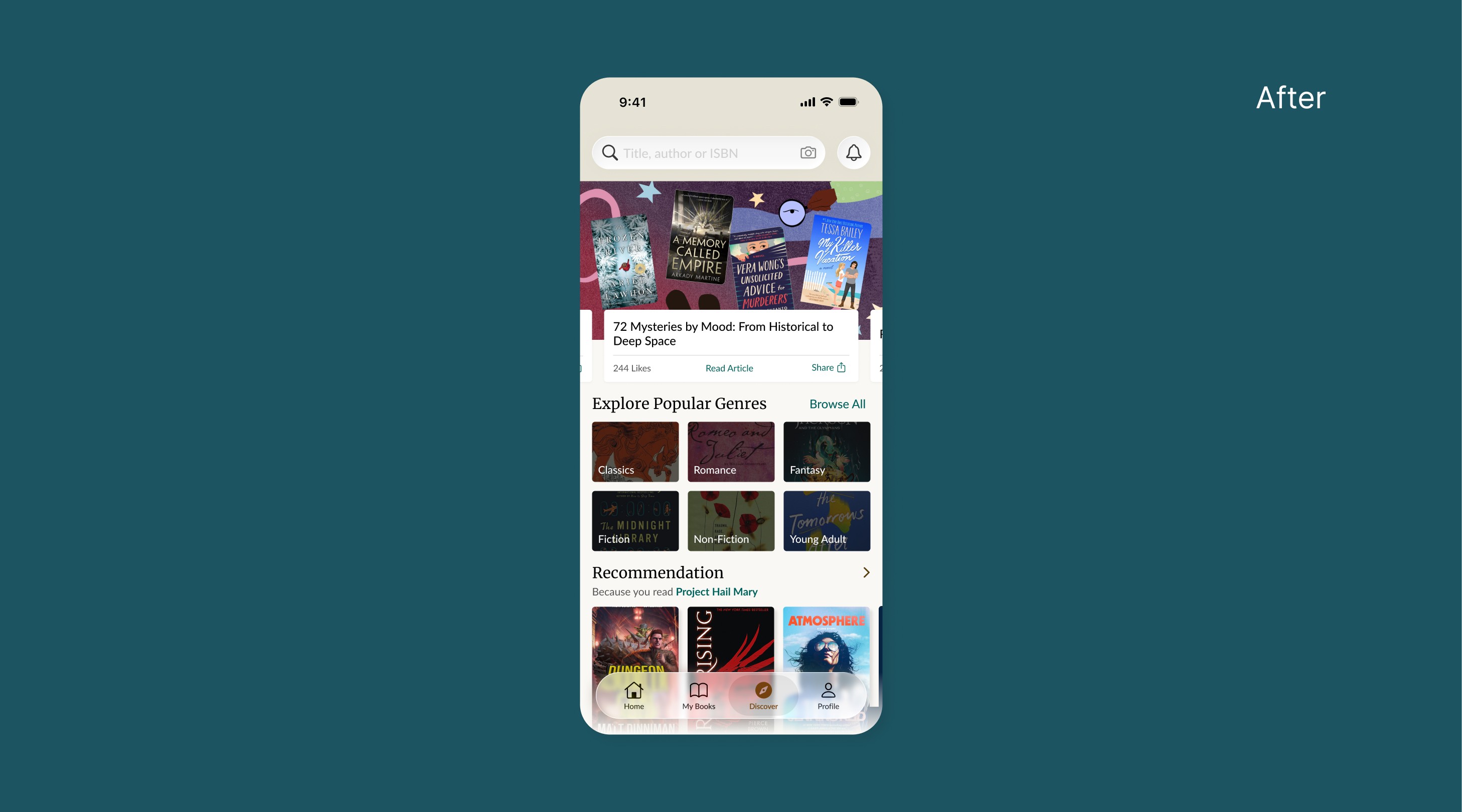
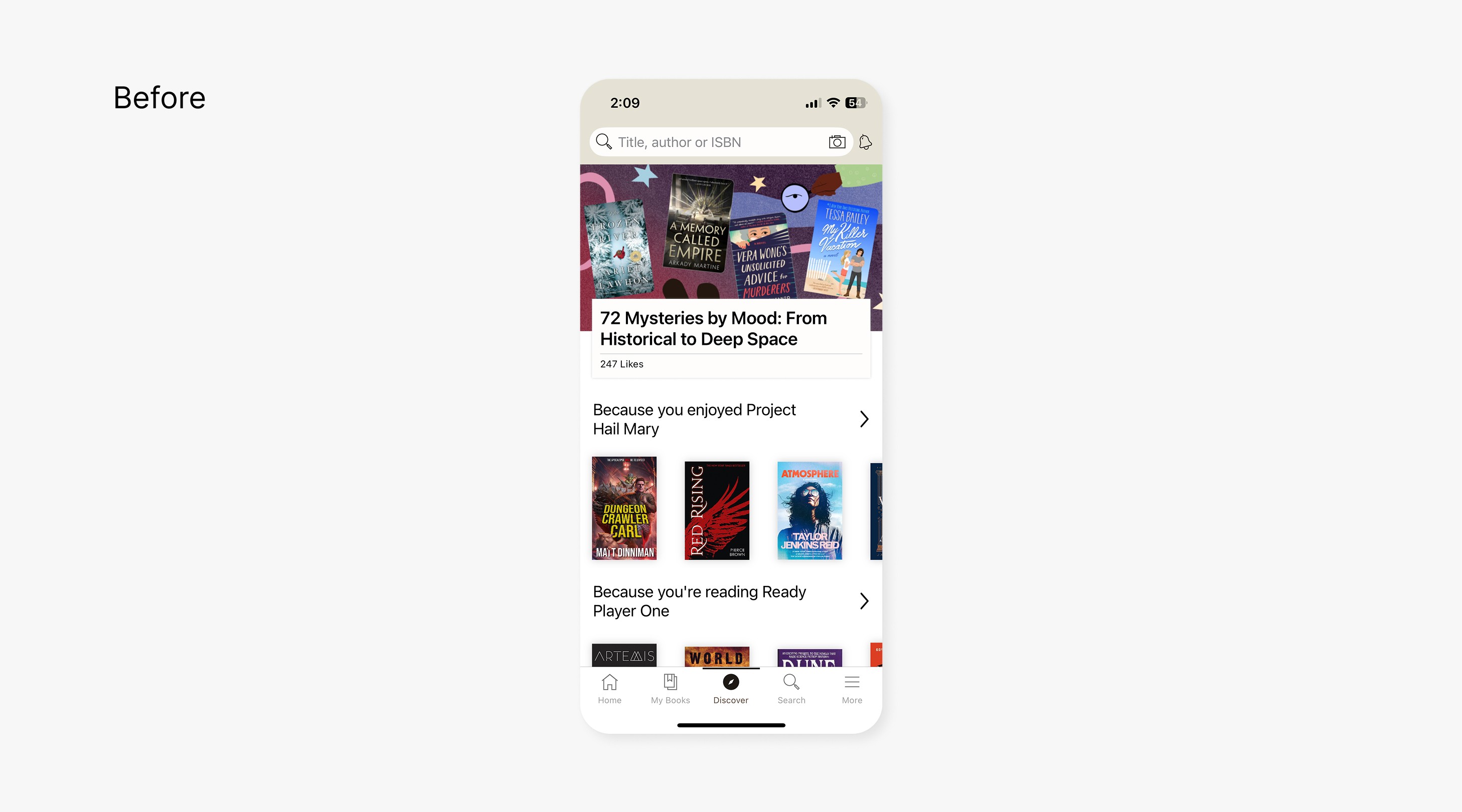
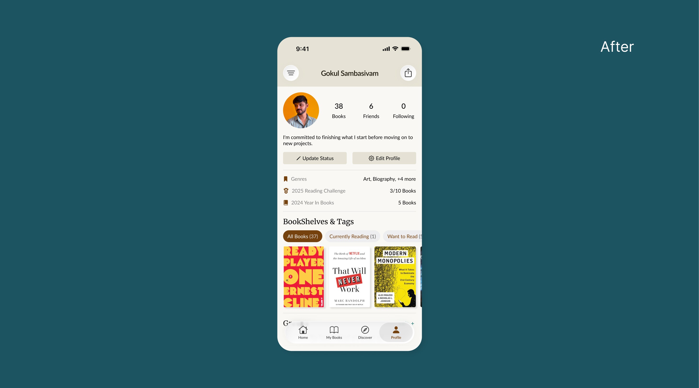
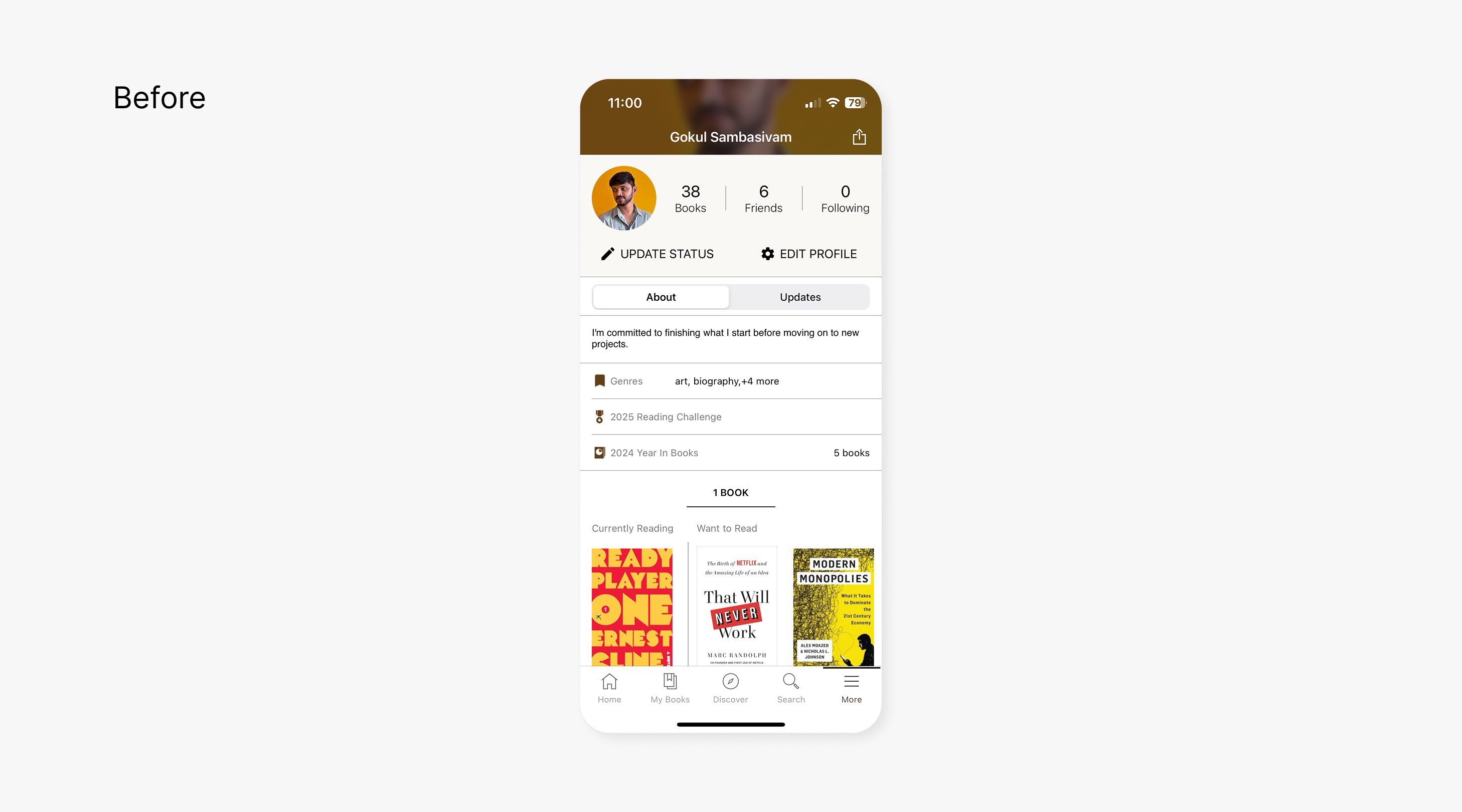
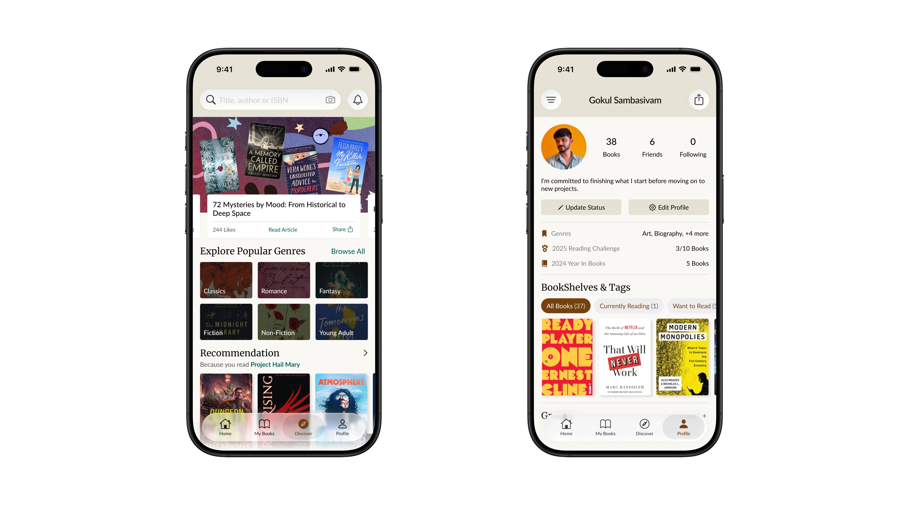
This project presents a thoughtful redesign of the Goodreads mobile app, concentrating on measurable improvements in user experience while upholding the brand’s established identity. The showcase details a series of refinements across key screens, highlighting intuitive flows and enhanced usability, all within the existing visual framework of Goodreads.
This project presents a thoughtful redesign of the Goodreads mobile app, concentrating on measurable improvements in user experience while upholding the brand’s established identity. The showcase details a series of refinements across key screens, highlighting intuitive flows and enhanced usability, all within the existing visual framework of Goodreads.

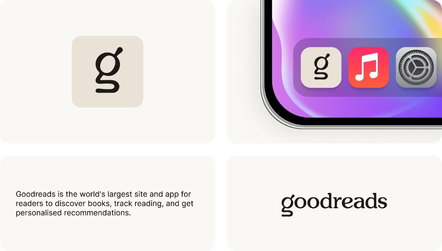
About Goodreads
About Goodreads
Goodreads is a social platform where readers track books they’ve read, want to read, and are currently reading. It helps users discover new books, share reviews, and get personalized recommendations based on their reading preferences. Goodreads connects readers through shared bookshelves and community features.
Goodreads is a social platform where readers track books they’ve read, want to read, and are currently reading. It helps users discover new books, share reviews, and get personalized recommendations based on their reading preferences. Goodreads connects readers through shared bookshelves and community features.
Why Redesign
Why Redesign
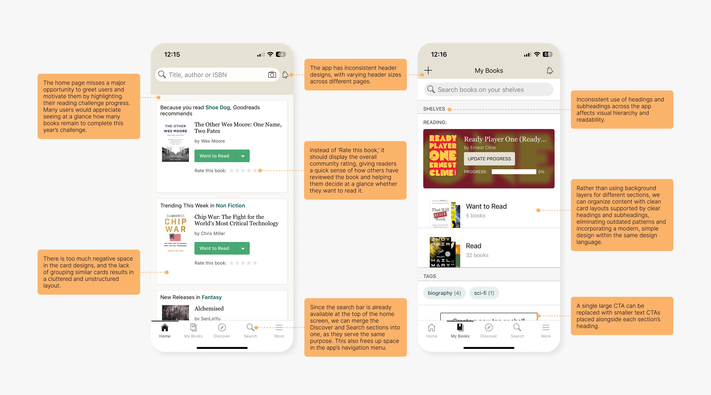
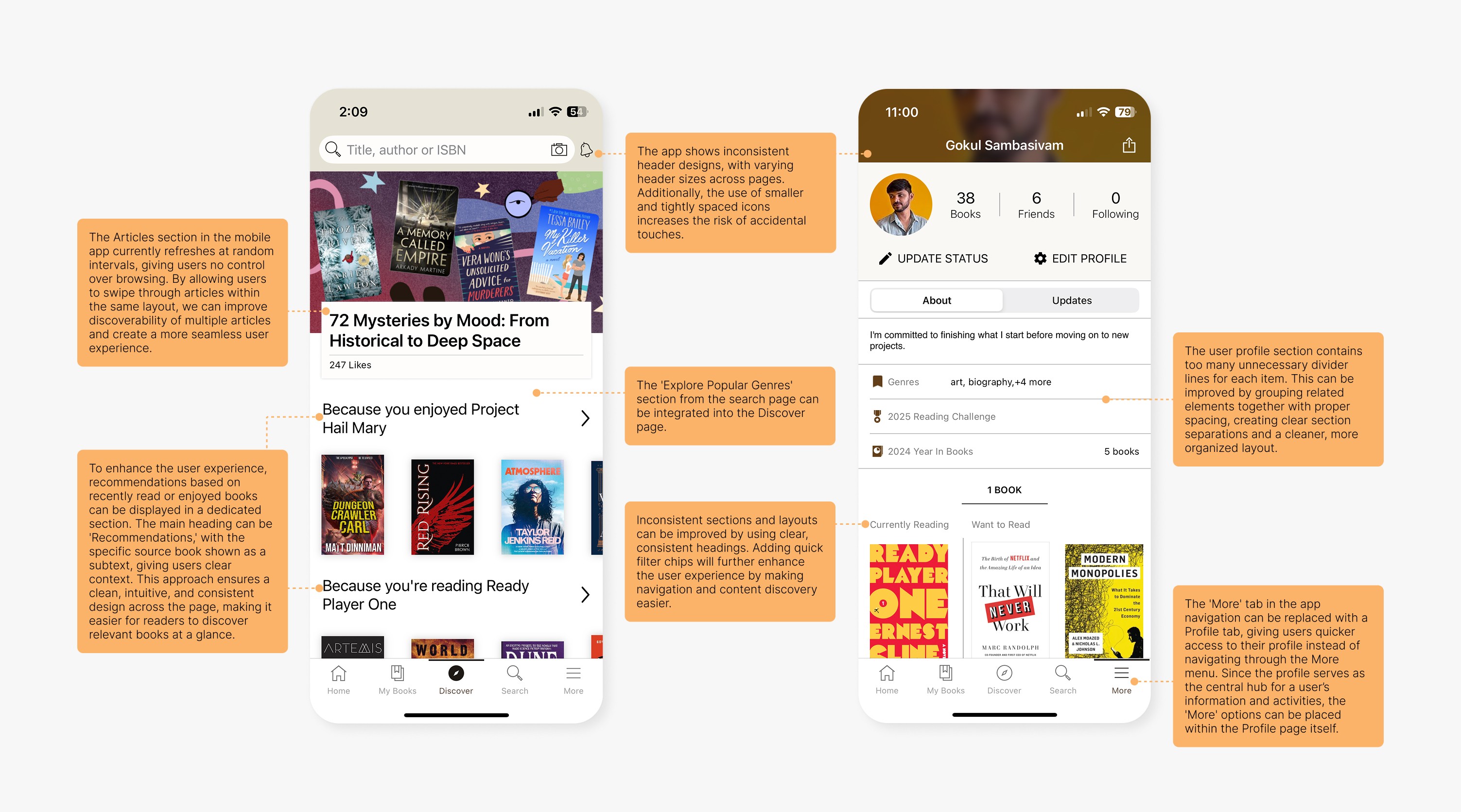
While Goodreads remains a valued platform for readers, the app’s interface has become increasingly dated and cumbersome. Users often struggle with deep navigation paths and cluttered layouts, making routine actions—such as adding books, sharing reviews, and exploring recommendations—less enjoyable. The redesign was motivated by a desire to elevate accessibility and efficiency, empowering readers to interact with their libraries and the broader community with greater ease.
While Goodreads remains a valued platform for readers, the app’s interface has become increasingly dated and cumbersome. Users often struggle with deep navigation paths and cluttered layouts, making routine actions—such as adding books, sharing reviews, and exploring recommendations—less enjoyable. The redesign was motivated by a desire to elevate accessibility and efficiency, empowering readers to interact with their libraries and the broader community with greater ease.
Design Constraints
Design Constraints
To challenge the notion that meaningful improvements require dramatic change, this redesign was guided by strict constraints:
To challenge the notion that meaningful improvements require dramatic change, this redesign was guided by strict constraints:
• Maintained the original typeface and core color palette used in the current app.
• Maintained the original typeface and core color palette used in the current app.
• Preserved key brand elements—logos, icons, and imagery—to keep the experience familiar and welcoming.
• Preserved key brand elements—logos, icons, and imagery—to keep the experience familiar and welcoming.
• Avoided radical layout shifts, focusing instead on reorganizing and reprioritizing content.
• Avoided radical layout shifts, focusing instead on reorganizing and reprioritizing content.
• No addition of new visual styles; every enhancement worked within the existing graphic system.
• No addition of new visual styles; every enhancement worked within the existing graphic system.
By setting these boundaries, the showcase demonstrates that substantial user experience gains can be achieved through refined information architecture, strategic space usage, and improved action visibility—all while honoring brand consistency.
By setting these boundaries, the showcase demonstrates that substantial user experience gains can be achieved through refined information architecture, strategic space usage, and improved action visibility—all while honoring brand consistency.
Redesigned Screens
Redesigned Screens
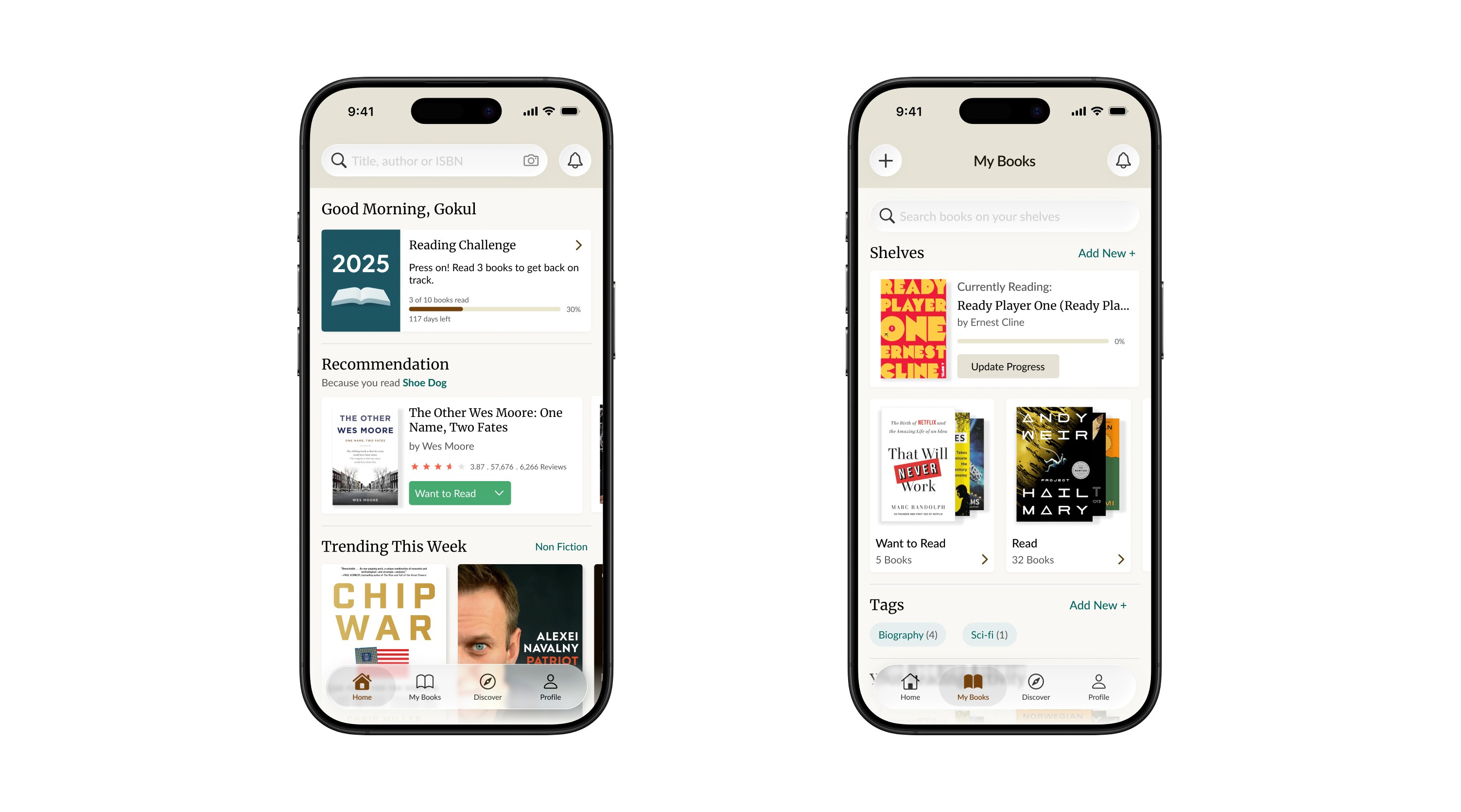
Comparison
Comparison